Sustainable Furniture Piece


Student: Nick Gutowski, Elizabeth Styczinski, Bri Moritz
Course: Design Fundamentals II, DS 220
Program: Interior Design

We designed our own process for building this chair, working with unfamiliar materials like cardboard to create a sculpture-like piece of furniture.  The importance of this project was to construct a durable chair, both functionally and aesthetically sound.  This project incorporated studies of form, function, ergonomics, and sustainability, all of which are necessary components used in the innovation of design.


State Street Restaurant Design: The Great Northern

Student: Stephanie Phillips
Course: Interior Design IV, DS 623
Program: Interior Design

This piece combines the discipline of Interior Design with a tangible design experience. Physical space is combined with a community experience that defines the essence of Wisconsin.

Right at home in the city of Madison, but a nostalgic retreat from modern stressors and distractions, The Great Nothern captures the spirit of the Midwest. Ripping a page out of an American history textbook, The Great Northern channels late 19th-century railroad expansion, offering tickets at the door and craft beers at both its station and train car bars. Scuffed wood floors, weathered brick arches, steel-vaulted ceilings, and warm light emanating from train lanterns define The Great Northern as not only a restaurant, but an establishment that fosters a sense of Midwestern pride built upon a strong sense of local community.

Floral Fungi: A Microbial Blooming

Student: Kate Morrick
Course: Textile Design: Print & Dye II, DS427
Program: TAD

This piece was inspired by the spring blooming of fungi within our Midwestern woodlands.  From the first step of taking and sourcing photos, to later arranging them into repeat in Photoshop, the entire piece was created digitally.  The application of the print onto the charmeuse silk fabric was also accomplished digitally through an Epson textile printer.

Body Modification

Student: Alexndra Ambur
Course: Art Metal I, Art 224
Program: TAD

This bracelet is designed to modify the body.  On the inside, are six hallow pillows of metal that have each of my immediate family members fingerprints etched into them.  Those fingerprints were then soldered onto an inch wide band of nickel.  On the outside of the bracelet I riveted an etched piece of new gold with the lyrics “you make me happy when skies are grey.”  When wearing the bracelet, they are physically carrying these family members with them.  When taken off the etch of the fingerprint leaves an imprint in the skin, so when the wearer takes the bracelet off they are still carrying the family members around on their wrist.  This allows them to always keep their family close in mind and body.  

Thicket


Student: Erin Aubrey
Course: Introduction to Textiles, 501, Mary Hark
Program: TAD

This piece is connected to design because I used several design elements when creating my piece. The first element I used was color. I chose a red ombre yarn to wrap the sticks in. I loved the smooth transformation from dark to light when I bound the sticks. I also think the color change made the piece more dynamic and interesting. The second element I considered was texture. I choose and textured yarn for my piece. The soft textured yarn juxtaposed with the wood makes an interesting combination.   Finally, I considered depth as a design element when creating my piece. Laying the sticks on top of each other creates depth while mimicking a pile of sticks one may see in nature.

New York City Condominium


Student: Kayla Carlson
Course: “Interior Design I”; DS 222
Program: Interior Design

The goal of this project was to first create a mood board for the theme “Cozy, Warm, Secure” and then translate the mood board into a living and dining room. For the mood board, design consideration was mostly aesthetic – the pictures represent the mood accurately, and the placement of the pictures on the mood board is balanced and visually pleasing. More importantly, the design of the apartment – both functionally and visually – was considered to create a cohesive and beautiful space. First and foremost, I took the clients’ needs into account and designed the space around those. I made sure that the spatial organization of the apartment would be functional for the clients, and then used certain materials that would create a cozy and inviting atmosphere.

Stuctural Coat

Student: Dvorah Elster
Course: Apparel and Structures 1, DS 153
Program: TAD

My coat was inspired by the structure of modern architecture, which incorporates a lot of sculptural elements to give the effect of dimension and innovative thought.  I am intrigued by the mathematical formulation of pieces of architecture and art, so I used pattern manipulations to transform a boxy single bust dart jacket into a form fitted princess seamed coat. I was influenced by the wavelike pleating that Georgia Hardinge incorporates in her Autumn/Winter 2011-12 line. With my fabric choices of double sided wool and a drapy sating, I juxtaposed the structural integrity of the architecture with the light airiness of the human interactions that dwell within.


Protection Coat

Student: Andrea Lutz
Course: Fabric & Apparel Structures I, DS 153
Program: TAD

 When faced with an enemy one wants to overpower that enemy and be the victor, the stronger of the two. If one is not the strongest than an illusion must be created to convince the enemy otherwise. There are many war garments that are made to create a sense of strength. War garments are not only created to make an impression on the enemy but also to instill a feeling of strength in the wearer of the garment. When one feels strong, it is easier to act strong. My coat is made to create and illusion of size and strength for the wearer and the viewer . This coat expands a person into something bigger than a normal human.   The fit of the coat is enlarged in the body and the sleeves but remains fitted in the neck and sleeve seam. This is so the coat is large, but does not look over-sized, like the coat is too large for the wearer. The expansion of the coat creates an illusion of size, the viewer assumes there is body where the coat swings out and the wearer feels larger, with the extra fabric surrounding and interacting with the torso and limbs.  The top of the coat creates an extension of the wearers hair.  Hair is natural decoration and protection. Expanding the hair downward in gigantic proportions creates an illusion and magnifies the already present hair of the wearer and makes the wearer appear larger than life, something beyond and bigger normal. The sharpness of the “hair” ends creates and element of danger and prevents the hair looking like something beautiful and friendly. 
 The overall goal of this coat is for it to act as armor that intimidates and fools enemy while instilling confidence in the wearer. 

Cardboard Furniture


Student: Victoria Johnson, Liz Nguyen, Bridget Schams
Course: Design Studies 220
Program: Interior Design

Our origami chair crafted and assembled carefully from cardboard, stimulates interest from all angles due to its intricate folds. The rounded surfaces along with the dramatic angles provide balance and ease to the piece.


Project 1, Color/Material Scheme Project


Student: Victoria Burton
Course: Interior Design I, DS 222
Program: Interior Design

I started this living room design based off of a mood board that embodied "lively, fun and invigorating".  The image associations helped give me direction in color and line types for the client's living room design.

DS 120 Project 2 - Black and White Composition

Student: Sadie Laing
Course: Design Studies 120, DS 120
Program: Pre-TAD

This piece connects to design because I created it by abstracting the design of an object (in this case, a ring) down to its barest design elements, and then using those design elements and my knowledge of design principles to create an entire environment based on that object. Essentially, I broke a designed object down into individual parts and rebuilt those components into my own design, which is the finished product. By translating one design into an entirely different one, this project deals with design on many different levels.


Collection Project, Early 1800’s Women’s Eveningwear Dress and Coat


Student: Naomi Skaggs
Course: Processes for Apparel Design: Clothing Construction II, DS-154
Program: TAD
 I eventually want to go into costume design, for film or the theater so I decided to take this opportunity to make a collection of 1800’s evening wear. I started with a commercial pattern of a Regency Era-style coat, but altered it to make it more extravagant. I added fullness and length to the collar as well as length to the skirt of the coat to give it a sweeping train. I also mimicked the rounded edge in the sleeve hem. While I wanted to remain historically accurate, I made the design choice to modernize it with bright patterned fabric to making it dramatic and slightly theatrical. I designed the coat to be worn over the blue and green dress.

Disquiet


Student: Felice Amato
Course: Independent Study Carolyn Kallenborn, Mary Hark
Program: TAD

This piece deals with domestic environment and references wallpaper, carpeting and textiles etc.  While not presenting a neat and tidy environment it is the references to the efforts to create one that supply much of the content of the piece.  I have been working with a lot of personal narrative that has involved a dramatic mid-life, years -long battle with my own ideas and ideals of domesticity, womanhood, and motherhood.  Interwoven with loss and guilt are elements of an archetypal journey and an ambiguous heroisms- a bit tormented and tarnished but true.

Black and White Composition


Student: Sarah Nasgowitz
Course: Design Studies 120, DS 120, Jung Hye Shin
Program: Pre TAD
Dream catchers have always fascinated me.  The geometric shapes created by the intertwined string, contrast against the circle that they are created in along with the feathers usually found attached to the bottom.  This is what inspired me to create this piece.I wanted to abstract the dream catcher shape.  I took the geometric shapes of the strings and placed feathery geometric shapes on top to create depth.  I decided to abstract the feathers to be more linear than being an organic feathery thing.  Resulting in a piece that doesn't even resemble a dream catcher anymore.

Furoshiki

Student: Naomi Skaggs
Course: Print and Dye I, DS-227
Program: TAD

This fabric is intended to be wrapped around a Harry Potter book so you can carry it with you safely wherever you go. I created a stencil of Hogwarts castle and used corn dextrin and dyed it in indigo multiple times. This technique gave it a strong contrast and a spooky backdrop. I knew I wanted my design be related to Harry Potter, but I also wanted to keep it abstract. When it is wrapped around the book you cannot tell that the silhouette of the castle is even present. It is a hidden surprise inside waiting to be discovered.

Embroidery and Beading Sampler

Student: Naomi Skaggs
Course: Structural Enrichment, DS228
Program: TAD

 I explored various stitches and beading techniques. I choose to create a fanciful world of vines and insects out of intricate stitches and beadwork. I had some plan when I first started but the surface of the fabric and the texture that was formed as I worked produced the end result. The way I arranged my lines, shapes and colors created a soft, flowing movement across the surface. I am inspired constantly by nature and the world around me, which is especially apparent in this piece.


Goodnight Gracie

Student: Mollie Gibson
Course: DS 623 Interior Design IV
Program: Interior Design

For this project we had to design a restaurant. We were given the shell of the building and we had to figure out the placement of the bar, kitchen, dining, storage, and reception areas. We were also responsible for picking out all the materials and finishes.


The Hinged Shelter

Student: Meryl Sell
Course: Design Fundamentals II, DS 222
Program: Interior Design

The Hinged Shelter is a disaster relief shelter designed to be comfortable, inviting, and easy to transport. Instead of being constructed similar to FEMA trailers with little to no attention to human psychological and social needs, The Hinged Shelter uses various elements and principles of design to make the temporary living space a place that the family will feel relaxed and ready to start their healing process sooner. The shelter also incorporates sustainable design, using materials with specific "green" qualities..


Silk Organza Yardage

Student: Lauren Hood
Course: Print and Dye II, DS 427
Program: TAD

These two yardages, which are paired together, were my opportunity to design my ideal fabric. The process involved finding inspiration, creating a screen, choosing fabric, dying the fabric and printing with two different methods.  The initial design work was to create a repeating pattern and transfer it onto a screen.  I then had to choose color combinations and techniques that I thought would compliment the fabric.  The dark purple fabric was created using a method called Rongalit (which alters the makeup of the silk fibers) and was then dyed in natural dyes.  The pink fabric was initially dyed with natural dyes and screen-printed with dye to avoid altering the hand of the fabric.  Each step of this process was a purposeful design decision.

Dr. Dane's Renovated Queen Anne House

Student: Kayla Carlson
Course: “Interior Design I”; DS 222
Program: Interior Design

This project consisted of a remodel of the first floor of a Queen Anne Victorian house; rooms that were updated included two offices, a physical therapy room, an exercise room, and a master suite. The client, a physical therapist named Claire Dane, needed a multi-functional space to cater to her clients’ needs as well as her own. The main issues related to design included preserving the historic charm of the client’s home while updating finishes and furniture; trying to utilize as many sustainable and low-to-no VOC materials as possible; and creating a functional spatial arrangement of furniture and equipment in all of the rooms. All of these needs were taken into consideration to create a healthy, eco-friendly environment that blends history with modernity.

Museum of Modern Art

Student: Julia Dane
Course: Design Fundamentals II, DS 220
Program: Interior Design


This model for a Museum of Modern Art was inspired by Eero Saarinen’s main terminal building at Dulles International Airport in Washington D.C. The concept of this museum was to combine form, line, shape, rhythm, and balance to create a simple but dramatic design. Saarinen’s use of sweeping, curvilinear lines was translated to this design through the use of curved roofs. Wood columns accent the roofs in order to add architectural interest and bring in an element of nature.

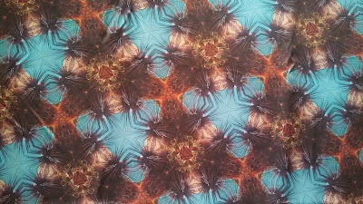
Kaleidoscope Sea Urchin Digital Print

Student: Erica Chronowski
Course: DS 427, Print and Dye II
Program: TAD

This piece is well thought out and carefully planned to create a seamless repeat of an image with many intricate lines and details.  It contains a sixty degree angle cut out of an image of a sea urchin, which is then flipped and rotated six times and put together to make a hexagon.  This is a kaleidoscope repeat, which is then put into a block repeat.  The result creates visual excitement and a coherent pattern, which translates well into a textile.

Functional Art Chair

Student: Emily Cruz, Kimberlin Schrader, Lindsay Kuehn
Course: Design fundamentals 220
Program: Interior Design

We were assigned to create a functional, lifesize chair out of cardboard. From there we designed a prototype and in designing and building the lifesize chair, we dealt with ergonomics and problem solving.

Our goal for this project was to design a modern piece of lounge furniture insired by organic shapes, particularly the paisly shape.


Captain America dress

Student: Eleanor Wroblewski
Course: Patternmaking for Apparel Design, DS 253
Program: TAD

This dress design connects popular culture and vintage apparel design details with a silhouette that is flattering on a modern figure.


Great Room Design: A Cozy Cabin

Student: Dina Posner
Course: Interior Design I, DS 222
Program: Interior Design

For this project I designed a great room for a hypothetical family of four. The project is related to design because I had to read about this family’s needs and desires, analyze them, and figure out design solutions that would give this family a room that satisfied their desires. For example, the kids in the family love to play games so I created plenty of open space for them to play, including giving a pre-existing platform a second purpose by making it a stage where the children could pull down curtains and play charades. Over all this project taught me the basics of interior design, evaluate needs where they are identified and your use problem solving skills to come up with successful solutions.

Collections project, Faux Leather Jacket

Student: Alexandra Ambur
Course: Processes for Apparel Design: Clothing Construction II, DS 154
Program: TAD

I altered a commercial pattern so that it embodies Rihanna, but still captures my geometric and structured style.  The commercial pattern only had one collar, but I made the design choice to pattern another collar, so it is a double collared jacket.  I added extra fullness to the peplum on the jacket.  There is topstitching on all of my seams to add a decorative and expensive touch.  The jacket is lined with a cheetah print to embody Rihanna’s wild vibe.  The faux leather added structure to the garment as well as giving it an edgy feeling.  This jacket represents Rihanna in that it captures her outgoing and contemporary personality.


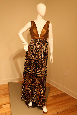
Collections Project

Student: Alexandra Ambur
Course: Processes for Apparel Design: Clothing Construction II, DS 154
Program: TAD

This long dress was made with the idea that Rihanna would wear it to the Grammys.  It started out as a commercial pattern, but the skirt was changed from a princess seam, A-line skirt to a gathered skirt.  The bodice of the dress was a regular V-neck shape and I changed it into a plunging V-neck.  I deliberately chose the faux leather for the bodice to give the dress structure as well as show off Rihanna’s strong, edgy persona.  The skirt was made out of a cheetah print to show her wild side.  These many design choices drastically changed the look of the commercial pattern into somewhat of my own design.  I believe I achieved Rihanna’s mood in this elegant yet edgy dress.


Weekender Bag

Student: Cory Linsmeyer
Course: Cloth to Clothing, DS 319
Program: Grad

This piece is an accessory design.  Taking into consideration durability and style I created a bag that coordinates with my collection.  As a frequent weekend traveler I developed this bag to be the perfect size for all the things I need without being too cumbersome.


A New Leaf 2 Dog Image

Student: Lauren Hood
Course: Manual and Computer Generate Imagery, DS 327
Program: TAD

This collection of prints displays the type of work a professional textile designer would make. We were to create a cohesive collection of prints that represented the University of Wisconsin and could be used on actual products.  Each design could only contain up to four colors and be produced in three color-ways. With these limitations, I took to designing something that was classic without being overly obvious.  The elements of design include very specific color choices and creating beautiful repeats.  Each scale of each pattern was carefully considered as was it’s cohesiveness with the rest of the collection.


Night of the City

Student: Young Kim
Course: DS 327: Computer Generated Imagery, DS 427: Print & Dye 2
Program: TAD

Inspired by the night-lights of cities, this collection embraces the advantages of digital prints. Bright colors and watercolor effects are used to demonstrate the lively metropolitan scene.


Bug's Life

Student: Young Kim
Course: DS 327: Computer Generated Imagery, DS 427: Print & Dye 2
Program: TAD

Purely inspired by Jennifer Angus, I have created 4 textile designs. This series of designs are my artistic approach to re-interpret the beauty of nature.


Beauty of Russia

Student: Young Kim
Course: DS 327: Computer Generated Imagery, DS 427: Print & Dye 2
Program: TAD

The set of screen-print collection is inspired by the beautiful traditions and architecture of Russia. All hand-drawn motifs are the most fascinating aspect about this piece.


Reclaimed Leather Tote Bag

Student: Stephanie Carnes
Course: Patternmaking for 3D Forms, DS 215
Program: Accessories Design

This tote was designed for a local company that sells recycled and repurposed handbags. The company presented their customer profile and business model to our class in order that we might generate handbag designs that could go into production for their target market. The challenge was to find ways to reuse materials that would have otherwise entered our waste streams. To address this topic, I chose to work with one of my favorite materials for my finished bag design: reclaimed leather. All leather used in this bag, as well as the quilted lining material, has been taken from an old leather jacket.

Final Project, Embellishment Module: Large Pelt


Student: Serenity Voss
Course: DS 501, Introduction to Textile Design
Program: Special Student (textile design)

Large Pelt was created in the Embellishment Module of Introduction to Textile Design. It expands on the ideas that I began with a small sample piece in the same class. I constructed it while it was pinned to a large wooden frame that I had built for this purpose. While working on it, I did not imagine the amazing tension that would result. Upon removing it from its frame, the cloth and the hundreds of toothpicks pierced into it moved like a great, heavy pelt. It has a heft and a fluidity that was quite unexpected.


In Space

Student: Sarah Harris
Course: Design Fundamentals, 120
Program: TAD

This project is connected to design because it requires knowledge of the concept of layering and texturizing a surface to make an optical illusion.

When I work with different materials such as thread and beads I am reminded that I can be as creative as I want to be. I began this piece without any knowledge of what I wanted it to look like and I just started to stitch. When my work is going well I don't feel rushed and I make sure that the piece is as full as I can get it and in this case, without it being too cluttered. This work really opened my eyes as to what embroidery can accomplish.

Name & Date

Student: Sarah Harris
Course: Textile Design: Structural I, 228
Program: TAD

This piece is connected to design because it requires knowledge of surface design, embroidery and beading. This work highlights the surface of fabric with different embroidery stitches and beadwork.

When I work with different materials such as thread and beads I am reminded that I can be as creative as I want to be. I began this piece without any knowledge of what I wanted it to look like and I just started to stitch. When my work is going well I don't feel rushed and I make sure that the piece is as full as I can get it and in this case, without it being too cluttered. This work really opened my eyes as to what embroidery can accomplish.

Jacket Project


Student: Madalyn Manzeck
Course: DS 153
Program: TAD

The inspiration for this jacket came from Dior's 1947 Spring/Summer collection. The "Bar suit", also known as Dior's New Look, captured the essence of how a woman should dress. The fitted jacket accentuated the woman's waist and bust and the full skirt added a feminine touch. I wanted my jacket to embody all of the characteristics Dior's ideal woman possessed and I feel I was successful.


Operation 5519


Student: Lucy Bea Jost
Course: Research and Thesis Project
Program: Grad Student

Instilling a sense of humor, nostalgia, and personal memory, my work explores how childhood artifacts visually communicate details of our relationship with material culture and our past and present selves.  Inspired by children’s toys sourced from thrifts stores across Wisconsin, these objects inspire narrative environments that speak to our relationship with items of the past, the dichotomy between childhood and adulthood, and the “grown-up” associations we might make with these items today.  I am inspired by how objects can retain memory, leaving us to wonder who owned them and what experiences were made around such items.  These dream-like spaces stand as a dialogue between our “stuff” and us, prompted by object associations and the memories, emotions, and actions evoked through sensorial experiences with the work.


Untitled Collar 1


Student: Lu Ann C. Mueller
Course: Experimental Testile Design: Paper and Cloth, DS528
Program: TAD

In terms of the bones of design fundamentals this neckpiece has radial balance, a geometric dimensional triangle multiplied to create a circle, with a type of monochromatic color scheme. The construction is laid out in a concentric pattern with a half drop for a network. The only immediate functionality lies in visual aesthetic, blurring the line between design and art with the simple choice of handmade paper and unwoven synthetic fabric as the media and sub straight. It’s the concept of applied art of fashion design, bodily adornment or ornament. Neckpieces or collars have a long rich history since the Stone Age. I see them as bridges between heart and mind illustrating a concept from concrete to ethereal to connect the two.

Paper Mache Skirt


 Student: Krisa Kuffel
Course: 3D Design, Art 104
Program: TAD

My piece is an artistic solution to the problem of not being able to find a way to have the iconic Marilyn Monroe flowing skirt look unless standing by a fan. This skirt, made of paper mache, permanently holds its flowing shape for an ideal graceful look. The finishing touches of spray paint and beading give the skirt an attractive look and ties the elements together for a completed piece.


Copies & Caffeine


 Student: Kate Morrick
Course: Experimental Textile Design: Experimental Paper making, DS528
Program: TAD

Inspired by late nights writing term papers and brewing an endless pot of dark roast, this sustainable textile was made from unused products inside the home.  Crumpled coffee filters are obsessively stapled together creating a textile which is remarkably strong.


Functional Art - The Letter Chair


Student: Kari Horn, Kim Schachte, Sydney Navis
Course: Design Fundamentals II, DS 220
Program: Interior Design

We designed and created a functional chair made out of cardboard. We used our own ideas and slight inspiration from the internet to design and create the lounge chair and ottoman.


Hybrid Salon


Student: Eryn H. Kim
Course: Interior Design I - DS222
Program: Interior Design


World is full of opposites... black and white, left and right, simple and complex. Through hybridization of these things, we create environments that reconcile each other. The daily experiences from these kinds of environments shape and form us into whom we are, which ultimately changes our perspective and thoughts, and helps us to reflect and look at both sides of the story... which is a virtue so valuable in a time stained with constant conflicts. This is where it happens. Welcome to Hybrid Salon.

Scarf II


 Student: Emily Osterbauer
Course: Weaving I, DS 229
Program: TAD

This piece is connected to design by being a well thought out process.  Decisions of weave, functionality, and color were all considered before construction..